

When you watch a film or branded video and it feels moody, dramatic, or vibrant, you’re often experiencing the result of clever colour grading. It’s one of those behind-the-scenes processes that most viewers won’t even consciously notice—but it plays a crucial role in storytelling. Colour grading isn’t about slapping a filter on your footage. It’s about crafting a visual language that speaks directly to the viewer’s emotions.
Whether you’re working on a short film, a corporate piece, or a YouTube vlog, understanding how colour grading works can take your content to another level. In this article, we’ll explore the power of colour grading in video production and how it helps set the mood, tone, and emotional resonance of your visuals.
The reason colour grading is so effective is because it adds intention to every frame. When you grade a video, you’re deciding what the audience should feel in each moment, even before they’ve processed what’s being said or shown. That emotional layer is incredibly powerful—it can heighten suspense, create warmth, or subtly suggest tension. Even in everyday content like interviews or vlogs, grading can add a sense of polish and professionalism that builds viewer trust.
More importantly, it helps your video stand out in a saturated digital landscape. With millions of hours of content uploaded online daily, visual storytelling that grabs attention quickly is a huge advantage.
What is Colour Grading?
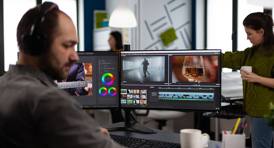
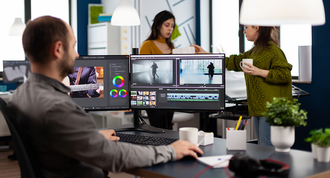
Let’s start with the basics. Colour grading is the process of altering and enhancing the colour of a video during post-production. It’s not to be confused with colour correction, which is about balancing exposure, contrast, and white balance to get footage to a neutral, consistent base. Grading goes further—it’s a creative decision-making process. You’re choosing how your video will look and feel.
Do you want a cold, desaturated look for a tense thriller? Or a warm, golden hue to evoke nostalgia in a family scene? Grading helps you make that choice. Filmmakers use tools like DaVinci Resolve, Adobe Premiere Pro, or Final Cut Pro to manually adjust highlights, shadows, midtones, saturation, and hues, painting with light and colour to create atmosphere.
Think of grading like digital cinematography—it’s where you finish the visual language of your story. Each tweak to the contrast or temperature helps align the visuals with the emotional beats of your narrative. It also allows you to correct any visual inconsistencies caused by changes in lighting or camera settings during the shoot.
For independent creators, understanding colour grading can be a game changer, giving your video a professional finish without breaking the bank. Whether you’re aiming for a vibrant, high-contrast music video look or the soft tones of a heartfelt documentary, the control grading offers is unmatched. With the right tools and a bit of creativity, you can transform raw footage into a polished, emotionally resonant piece of content.
How Colour Affects Emotion
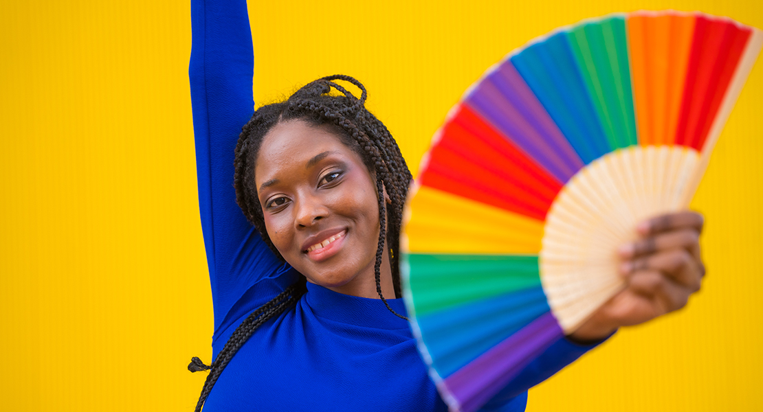
Colour has psychological impact—ask any designer or brand expert. Red can evoke urgency or danger, blue feels calming or distant, yellow is cheerful, and green often symbolises nature or unease, depending on its shade. In video production, colour grading is a powerful emotional cue. A horror film might use sickly greens or blue undertones to create discomfort. Romantic scenes might lean into peachy pinks or soft warm tones. Even subtle shifts in contrast and saturation can completely alter how a scene feels. It’s not just about looking good—it’s about feeling right.
This is where colour grading becomes emotional storytelling. When done well, it complements the script, acting, and cinematography to deliver a complete, immersive experience. Colour can even hint at genre or time period—sepia tones for nostalgia, neon palettes for sci-fi, desaturated blues for gritty realism. It becomes a visual language that speaks directly to the audience’s subconscious.
The key is intentionality. Every colour choice needs to serve the story. A warm grade can make an ordinary moment feel nostalgic, while a cool tint might add emotional distance or melancholy. Editors often use colour to guide mood transitions—shifting from cool to warm as characters grow closer, for instance. It’s also a clever way to signal internal conflict. Scenes might begin warm and fade to cooler tones as tension builds. These emotional cues are often felt more than noticed, but they shape the viewer’s response. That’s the magic of colour—it bypasses logic and taps straight into feeling. Get it right, and you’re not just telling a story, you’re immersing your audience in it.
Setting the Tone Across Genres
Each genre has its own colour “language”. Think of a gritty crime drama—it’s probably dark, muted, and filled with shadows. A fantasy epic might be vibrant with deep blues and golds. A documentary could use natural tones to keep things grounded and authentic. Colour grading helps define these genre expectations. As a creator, you can use or subvert these norms to influence your audience’s experience. A comedy with an overly cool or sterile palette might feel emotionally distant, while a horror film graded in pastel tones would feel oddly dissonant. Tone-setting is about consistency—keeping your palette coherent throughout the video so viewers are emotionally anchored, even if the narrative shifts.
Genres carry visual traditions for a reason—they’ve evolved to support particular moods and emotional responses. But playing within those conventions doesn’t mean you can’t be creative. You can reinforce genre through colour, or you can deliberately challenge it. Think of a thriller that starts with bright daylight scenes, then slowly drains colour as suspense tightens. Or a children’s film that uses dark palettes to introduce unexpected depth.
The point is, your colour choices tell the viewer how to feel—and when those choices line up with genre expectations, it feels seamless. When they clash, it creates tension. As long as that tension is intentional, it can be incredibly effective. Ultimately, good tone-setting through colour grading is about clarity. You’re setting the emotional stage, one shade at a time.
Techniques to Create a Cinematic Look
One of the most sought-after results in colour grading is the “cinematic” look. But what does that actually mean? It’s often about dynamic range—preserving detail in both shadows and highlights—and using colour contrast to guide the eye. Techniques like “teal and orange” grading (common in action films) work because they combine warm skin tones with cool backgrounds, making characters pop.
Film emulation LUTs (Look-Up Tables) can replicate the grain and colour science of old film stock. Vignettes, selective saturation, and even subtle film grain overlays can all contribute to that polished, big-screen feel. It’s not about copying Hollywood—but about using similar tools to elevate your production values.
Achieving a cinematic look also involves thinking about depth and texture. Soft highlight roll-off and rich midtones can give a more natural, filmic feel compared to the harshness of raw digital footage. Grading tools like curves and power windows allow you to finesse contrast and isolate tones—perhaps brightening a subject’s face without affecting the entire frame. Layering adjustments gives you fine control, so you’re not just applying a blanket look, but sculpting the mood. It’s also about restraint.
Cinematic doesn’t mean flashy. Often, it’s the quiet subtlety of the grade that gives it that professional finish. Think of colour grading like seasoning food—just enough to enhance, never so much it overwhelms.
Colour Grading for Branding and Consistency
For businesses, colour grading isn’t just about mood—it’s about brand identity.
A fitness brand might favour sharp contrast and saturated colours to feel
energetic, while a luxury skincare company might go for soft, neutral tones to
convey calm and elegance. Keeping a consistent colour grade across video
content builds trust and recognisability. If your videos are part of a campaign
or ongoing series, consistent grading helps unify your message. Viewers might
not articulate it, but they feel the cohesion. That’s the power of visual
branding through colour.
It also helps when working across platforms—your Instagram reels, YouTube ads, and website banners should feel visually related, even if they serve different purposes. This is especially important for startups and smaller brands trying to carve out a niche. Colour becomes part of your visual language. And the more you use it consistently, the more it becomes associated with your brand’s voice. Pre-made LUTs tailored to your palette can speed up your workflow and maintain uniformity across editors or teams. It also makes collaboration smoother when you’re working with freelance editors or agencies unfamiliar with your style.
It’s also wise to create a reference library or mood board for your colour direction. Ultimately, grading for branding is about clarity and intention. You’re not just colouring a video—you’re reinforcing your identity, building trust with your audience, and making sure your brand looks as good as it feels.
Matching Shots for Visual Continuity
Even if you’re shooting all your footage with the same camera, lighting changes and location shifts can cause inconsistencies in colour. Colour grading helps you match shots so they look like part of the same story. This is especially important in dialogue scenes or multi-camera setups. It’s not glamorous, but it’s essential. When one shot looks dramatically different from the next, it can be jarring—and pull viewers out of the story. Professional colourists often spend hours just matching exposure, skin tones, and colour temperature across a single scene. The result? A seamless, immersive viewing experience. It’s the kind of work that rarely gets noticed—but that’s the point. When it’s done well, it becomes invisible.
Continuity is the
unsung hero of visual storytelling. Imagine cutting from a warm, golden shot to
a cold, blue-tinted one without reason—it breaks the spell. Matching shots maintains
emotional flow and spatial logic. It also keeps your audience focused on the
content, not the inconsistencies. If you’re working with footage from multiple
cameras or at different times of day, grading is the glue that holds it all
together.
Even small details like adjusting white balance, reducing colour casts, or
matching contrast can make a world of difference. Use scopes and reference
stills to stay consistent. The goal isn’t to make everything look
identical—it’s to make everything feel like it belongs in the same world. And
that’s what keeps your video polished and professional.
Working with LUTs and Presets
LUTs (Look-Up Tables) and presets are brilliant time-savers—especially for solo creators or small teams. These pre-designed grading tools can instantly give your footage a polished, stylised look. While they shouldn’t replace proper colour grading, they’re a great starting point. You can find LUT packs tailored to different genres—like “moody filmic”, “golden hour”, or “cool documentary”. Many professionals also develop custom LUTs for specific projects or brands. The trick is to use them wisely—don’t just slap one on and call it done.
Think of LUTs like seasoning: use them to enhance, not overwhelm. Always balance your footage first—adjusting exposure, contrast, and white balance—then apply the LUT and tweak it to suit the shot. Some LUTs work better with certain cameras or lighting setups, so test before committing. You may need to tone down intensity or fine-tune highlights and shadows to get the right feel.
Over time, you’ll get a sense of what suits your footage best. If a particular LUT consistently delivers, you might even build it into your visual identity. But remember: LUTs are tools—not shortcuts. The real artistry lies in your creative judgement. Use them as a launchpad, not a crutch. Let your story and aesthetic guide the final look.
A strong grade doesn’t just make a video look good—it makes it feel right. And while LUTs can help you get there faster, the power still lies in your ability to shape emotion through colour.
Collaborating with Colourists

If you’re working on a larger production, you might hand off your edit to a professional colourist. This person specialises in colour science and grading software—and can take your visuals to the next level. The key to a successful collaboration? Communication. Share your vision, references, and mood boards. Be clear on genre, tone, and audience. A good colourist doesn’t just make your footage look pretty—they help tell your story visually. And if you’re grading yourself, studying how colourists work can still elevate your own projects. Understanding their workflow can also help you prepare cleaner, more organised edits that are easier to grade—saving time and avoiding surprises later in post.
The more context you provide, the more a colourist can deliver something that aligns with your creative goals. Discuss emotional beats, character arcs, and any shifts in tone across the narrative. Share reference films or photography that capture the feeling you’re going for. And be open to feedback—they might spot visual storytelling opportunities you hadn’t considered. It’s also helpful to include camera notes, lighting conditions, or any unusual shooting setups that could impact the grade.
For remote collaborations, exporting stills or proxy clips with guide grades can keep everyone aligned. If you’re handling grading solo, learning from pros—via tutorials, case studies, or even just watching behind-the-scenes breakdowns—can sharpen your eye and boost your confidence. Whether you’re working alone or with a team, colour grading is always stronger with clear creative intent.
Final Thoughts: Colour is Storytelling
Colour grading is often the invisible magic of a powerful video. It shapes mood, tone, pace and emotion—all without saying a single word. Whether you’re creating a documentary, advert, short film or corporate video, understanding how colour affects your audience gives you creative control. With the right approach, you can use grading not just for style, but for substance. Because when it comes to video, colour isn’t just visual. It’s storytelling.
That’s what makes grading such a crucial part of the process. It’s not just the cherry on top—it’s baked into the entire visual language of your film. Think of it as emotional punctuation. A warm tone might imply safety or nostalgia, while desaturation could signal tension or isolation. Even subtle tweaks can reinforce story beats or guide the viewer’s attention. You can also differentiate timelines, perspectives, or dream sequences through carefully crafted colour palettes.
These visual cues add layers of meaning that support your narrative without drawing attention to themselves. If you’re intentional with your grading, you can shape how people feel scene by scene. And the best part? It’s all happening below the surface. The viewer might not know why a moment felt powerful or unsettling—but you do. That’s the real power of colour grading. It’s not about being flashy—it’s about being felt. If you’d like help taking your video production to the next level without a huge budget, get in touch with us at Spiel for a chat—we’d love to explore how we can support your vision.