


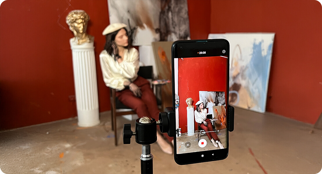
Interactive video can be a brilliant way to engage your audience—but only when it’s done right. It’s not just about slapping on some clickable buttons and calling it a day. Designing a truly effective interactive video takes planning, empathy, and a clear understanding of how people behave when they’re in the driver’s seat.
Whether you’re crafting an e-learning module, a product explainer, or a choose-your-own-adventure masterpiece, here are 11 common pitfalls to steer well clear of.
1. Jumping in Without a Clear Objective
Before you hit record or open your scriptwriting app, ask yourself: What’s the goal? Are you trying to educate, entertain, convert, or gather feedback? Without a defined purpose, your video risks becoming confusing or directionless. The best interactive experiences are built around a single, focused intent.
When you skip this step, it’s easy to get distracted by shiny features or clever branching ideas that don’t actually serve your audience. You might end up creating something that looks impressive but lacks impact. Having a clear objective gives your story direction and ensures that every branch, choice, and outcome adds value to the user experience. It helps you decide what kind of tone to strike, what type of questions to pose, and what action you want the viewer to take at the end.
For example, if your goal is to educate, your structure might focus on knowledge checks, quizzes, or real-life scenarios. If you’re promoting a product, your focus should be on showing value quickly, guiding the viewer towards a buying decision without making it feel too pushy. A recruitment video? Then maybe you want your audience to explore different roles within the company or “choose their path” based on skillsets.
Whatever it is, write it down. Stick it on your whiteboard. Come back to it with every script draft. Your objective is the backbone of your interactive story—ignore it, and everything else risks collapsing.
2. Overcomplicating the Structure
It’s tempting to build sprawling decision trees with endless outcomes. After all, that’s the fun part of interactive video—giving viewers freedom to choose and explore. But here’s the truth: more doesn’t always mean better. Overcomplicating your branching logic can confuse viewers and overwhelm your production team. Start small. Keep the navigation intuitive and the story manageable. You can always expand later.
One of the biggest challenges with complex interactive structures is consistency. The more branches you create, the harder it becomes to keep the tone, pacing, and quality uniform across all paths. Viewers may feel short-changed if one option leads to a rich, meaningful story, while another fizzles out or feels underdeveloped. Worse still, a tangled structure often results in production delays, budget blowouts, and broken logic—none of which serve your final outcome.
Instead, consider using soft branches that rejoin a central narrative arc. This gives the illusion of autonomy while keeping things streamlined behind the scenes. You could also design ‘loop-back’ moments that allow users to explore all their options without getting lost in a maze of content.
Think about user experience, too. If someone is three decisions deep and doesn’t know how they got there, chances are they’ll quit. Simplicity is powerful. A well-crafted interactive experience with just a few meaningful decisions can be far more impactful than one with endless paths and little direction.
Plan carefully. Make choices count. And remember—you’re not designing a logic puzzle. You’re telling a story.
3. Forgetting to Map the Journey
You wouldn’t design a website without wireframes—so don’t write an interactive video without a flowchart. Map out every choice, branch, and reconnect point before you write a single line of dialogue. It’ll save you countless headaches later when you’re trying to make it all work together.

Interactive video design is equal parts storytelling and structure. Without a visual plan in place, it’s incredibly easy to lose track of narrative flow, duplicate content, or accidentally contradict yourself across different paths. A simple flowchart—or better yet, a dedicated interactive storyboard—gives you a bird’s-eye view of how your experience will unfold, helping you spot weak spots, repetition, or imbalance before you commit to editing or filming.
Mapping the journey also forces you to think like your viewer. What will they see first? What choices are presented—and in what order? Do certain decisions naturally lead to others, or are there opportunities to merge paths and simplify the experience? These questions help shape not just the content, but how it’s delivered.
You don’t need fancy software either—pen and paper will do, or a digital whiteboard like Miro or Whimsical. Start with your opening scene, plot out decision points, and label your outcomes. Then walk through it step by step, as if you were the audience. Do the paths feel logical? Do they offer variety without redundancy?
Getting this right up front means fewer rewrites, cleaner production, and a much smoother edit. Think of it as your interactive blueprint.
4. Weak or Pointless Decisions
There’s nothing more frustrating than clicking on an option… only for nothing to really change. If you’re giving the viewer control, make it matter. Each decision should lead to something different, even if it’s just a shift in tone or perspective. Fake choices feel like wasted clicks.

Weak decisions are a quick way to erode trust in your experience. Viewers start to realise that no matter what they pick, the outcome is the same—and that makes your interactivity feel more like a gimmick than a genuine narrative feature. When people engage with your video, they expect a cause-and-effect relationship. Even subtle variations—such as a character’s facial expression changing, a slightly altered line of dialogue, or a detour before rejoining the main path—can give the viewer that satisfying sense of influence.
You don’t have to write a completely different ending for every possible choice. That would be a production nightmare. But you do need to offer meaningful variation. A great approach is to build decisions around emotional tone, character relationships, or prioritisation of content. For example, in a training video, allow viewers to choose the order in which they explore topics. In a story-driven piece, let their decisions affect how much information they uncover or which character they align with.
Above all, respect your viewer’s input. The magic of interactive video is rooted in empowerment. If the choices don’t matter, your video might as well be linear.
5. Unclear Calls-to-Action (CTAs)
Your interactive elements need to be obvious and purposeful. Don’t hide them in tiny text or ambiguous buttons. Use clear, directive language like “Choose Your Path” or “Explore Feature”. If people aren’t sure what to do next, they’ll simply stop watching.
Clarity is everything in an interactive experience. When your CTAs are vague, too small to tap, or placed inconsistently, users become hesitant. That moment of hesitation can kill momentum. A well-crafted CTA doesn’t just tell your viewer what to do—it also communicates why it’s worth doing. Phrases like “Find your fit”, “Test your knowledge”, or “Get a sneak peek” spark curiosity and keep engagement high.
Think about timing, too. If your CTA appears too early, the viewer may not be ready to act. If it comes too late—or disappears too quickly—they might miss it altogether. Give people a moment to absorb the content and then invite them forward. And wherever possible, test placement across devices. What works beautifully on a laptop might be clunky or invisible on a mobile screen.
Also, be mindful of CTA fatigue. If every 10 seconds your video demands a click, it quickly becomes exhausting. Pace your interactions carefully and vary the action. Sometimes it’s a choice. Other times, it might be a drag-and-drop, a hover, or even a quiz. But every one of those actions should have a clear label, a visual cue, and a reward for engaging.
Make it simple. Make it enticing. And most importantly, make it clear.
6. Inconsistent Tone or Pacing
If one path is light-hearted and another suddenly becomes deadly serious, the viewer can feel jolted—unless that shift is intentional and well executed. Similarly, keep branch lengths relatively even. A two-minute path versus an eight-minute one can throw off the experience. Cohesion is key.
Inconsistency in tone or pacing can disrupt immersion, making the viewer feel like they’ve stumbled into a different video altogether. While branching narratives are designed to offer variety, they still need to feel like different rooms in the same house—not different buildings on separate streets. Establish your tone early, and set expectations for the experience ahead. If there will be tonal shifts—say, from comedy to drama—use transitional cues like music, colour grading, or narration style to guide the viewer gently.
The same principle applies to pacing. If one option launches into a long monologue while another delivers a quick montage, the experience can feel lopsided. Uneven pacing risks disengagement, especially if viewers feel they’ve “missed out” by choosing the shorter or slower path. Try to keep major branches within a reasonable duration of one another, and maintain a rhythm that reflects your content goals—whether it’s education, entertainment, or exploration.
Consistency builds trust. It reassures the viewer that, no matter what they choose, they’re still part of a cohesive journey. That doesn’t mean every path has to be the same—it just means they all need to feel intentional, well-paced, and tonally aligned with the rest of the experience.
7. Not Optimising for Mobile Devices
It’s 2025—most of your audience will be watching on a phone. If your video only functions well on desktop, you’re missing the mark. Test all interactions for touchscreens. Buttons need to be big enough to tap, and text must remain readable on smaller screens.
Mobile-first design is no longer optional—it’s the baseline expectation. With more users consuming video content on the go, interactive elements must adapt fluidly to smaller displays. If a user has to pinch and zoom just to hit “next”, chances are you’ve already lost them. Ensure that buttons have generous padding, and avoid placing interactive elements too close together. A thumb-friendly interface makes all the difference when it comes to keeping viewers engaged.
You also need to consider load times and data usage. Many mobile users are on slower networks or limited data plans. Keep your file sizes optimised, pre-load assets where possible, and test performance across both iOS and Android devices.
And don’t forget orientation. Will your video work in both portrait and landscape mode? Can the interface adjust responsively? Think beyond traditional “desktop thinking” and consider how the video flows in a vertical swipe environment.
The key takeaway? If it doesn’t work seamlessly on mobile, it doesn’t work. Test often. Design responsively. And always assume your audience is watching with one hand, in a noisy environment, with a dog on their lap and ten tabs open.
8. Poor Accessibility Considerations
Interactive doesn’t have to mean inaccessible. Make sure you include captions, audio descriptions, and intuitive navigation. Avoid fast-moving visuals or time-limited prompts that may disadvantage some users. Design your video so everyone can engage with it, regardless of ability or device.
Accessibility isn’t just a compliance checkbox—it’s part of creating inclusive experiences that respect your whole audience. And let’s face it: if a portion of your viewers can’t fully engage with your video, you’re not only losing reach—you’re missing out on valuable impact.
Start with captions. These aren’t just for those who are hard of hearing—they’re essential for viewers in noisy or silent environments. Next, think about screen reader compatibility and keyboard navigation. Are your interactive buttons clearly labelled with alt text? Can users tab through choices if they can’t use a mouse or touchscreen?
Avoid strobing effects, rapid transitions, or colour-only cues that could be problematic for neurodivergent users or those with visual impairments. Also, reconsider using time-limited decisions unless they’re essential to your content. Giving users time to read, think, and act ensures that no one is excluded because of a cognitive or physical barrier.
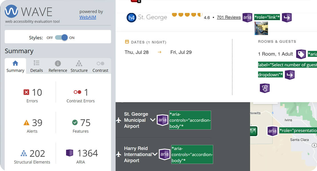
Use clear, high-contrast design. And test your interactive video with accessibility tools like WAVE or AXE to flag potential issues early.
Ultimately, accessible content isn’t just good ethics—it’s smart design. The more people who can enjoy and interact with your video, the more successful your project will be. Accessibility expands your reach—and your impact.
9. No Feedback on Choices
If someone makes a choice and the video continues as if nothing happened, they’ll wonder what the point was. Reinforce the outcome—whether through a change in scenery, tone of voice, or direct on-screen confirmation. Acknowledge the viewer’s input. It makes the experience feel personal.
The entire promise of interactive video rests on user agency. When someone taps a button or chooses a path, they’re investing attention and curiosity. Ignoring that action—or failing to reflect it in a meaningful way—breaks immersion. Instead of feeling empowered, the viewer ends up feeling dismissed.
Feedback doesn’t have to be huge. A short line of dialogue acknowledging their choice (“Good call!” or “Let’s see where this goes…”) can work wonders. Visually, you might change the environment, introduce a different character, or even tweak the music to match the tone of the decision made. The more your viewer feels like their choice shifted the story—even subtly—the more satisfying the experience becomes.
You can also use feedback loops to build anticipation. Let viewers see the consequences of earlier choices show up later in the story. Maybe a side character remembers their past action. Or a location changes based on an earlier decision. These callbacks reward attention and encourage replays.
Ultimately, feedback is about trust. It tells your viewer: “You’re not just watching—you’re participating.” So honour their input. Show them it matters. That’s what makes interactive video truly shine.
10. Ignoring Narrative Flow
You’re still telling a story—even if it has multiple routes. Every scene needs a clear beginning, middle, and end, and each branch should feel like a complete thought. Avoid abrupt transitions or endings that feel rushed. Keep your viewer emotionally invested, whichever path they choose.
Think of narrative flow as the connective tissue between your scenes. If the pacing is inconsistent or the tone veers off wildly, viewers will feel like they’ve lost the thread. Just because interactive video is non-linear doesn’t mean it should feel disjointed. Each choice should lead into the next with purpose and logic—just like scenes in a well-structured film.
To maintain a smooth flow, write each branch with clear narrative beats. Introduce a scenario or question (the beginning), escalate or develop it (the middle), and resolve or redirect the story (the end). Even if branches reconnect later, they need to feel complete in isolation. Otherwise, your viewer is left feeling like they took a detour to nowhere.
Transitions are crucial, too. Use visual continuity (like consistent camera framing or lighting), thematic music, or short narration to bridge scenes. This keeps the viewer oriented and emotionally connected to the experience.

Lastly, remember that viewers are emotionally invested in the paths they choose. They’ve made decisions—don’t punish them with jarring cuts or empty endings. Instead, reward them with meaningful progression, character development, or a sense of discovery. Narrative flow isn’t just about structure—it’s about honouring the viewer’s journey.
11. Skipping the Testing Phase
This one’s huge. Just because it works for you doesn’t mean it’ll work for everyone else. Test with real users on real devices. Watch how they navigate, where they click, and where they hesitate. You’ll uncover usability issues, broken logic, or unclear wording that you’d never spot on your own.
Testing isn’t a final checkbox—it’s an ongoing, essential part of the process. The way you think users will experience your video is often completely different from how they actually do. For example, you might think your decision points are obvious, but a tester might miss them entirely because of low contrast or unclear labelling.
Use both qualitative and quantitative feedback. Ask viewers how the experience felt—was anything confusing or unsatisfying? Did they feel like their choices mattered? Pair that with heatmaps, click data, and completion rates to see which parts of the video are holding attention or losing it.
Test on various devices and browsers, too. A video that plays beautifully on your laptop may lag or misalign buttons on a mobile. Pay attention to loading speeds, buffering, and touch interactions.
Also, test with a diverse group of users. People with different backgrounds, tech confidence levels, and accessibility needs will offer insights you wouldn’t get from your internal team alone.
And perhaps most importantly—test early. Don’t wait until everything is rendered and polished. Test a prototype or rough cut first, so you can course-correct before investing more time or budget. A few solid test rounds can save you from launching a beautiful, broken experience.
Final Thought
Interactive video is a powerful
tool—but it only works if it’s thoughtful, strategic, and user-focused. Avoid
these common mistakes, and you’ll be well on your way to creating something
that doesn’t just entertain—it connects, converts, and keeps your viewer coming
back for more.
So slow down, map it out, and above all—make it worth clicking.
If you’re considering creating an interactive video, feel free to contact us here at Spiel for a free consultation with one of our experts.