

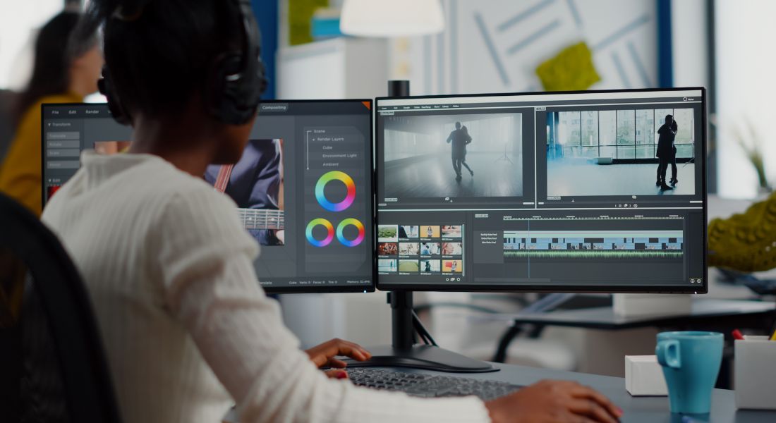
We all want our social ads to stand out in a busy feed especially when attention spans are shorter than ever. Animation can be a brilliant way to stop the scroll, highlight key messages, and bring a brand’s personality to life. With just a few seconds to make an impact, movement often works better than static visuals.
But there’s a fine line between eye-catching and overwhelming. When every element on screen is bouncing, flashing, spinning, or flying around, it stops being engaging and starts being exhausting. The viewer doesn’t know where to look, the message gets lost in the chaos, and instead of holding attention, your ad becomes easy to skip.
Animation should be a tool to enhance your message, not distract from it. In this guide, I’ll walk you through how to find that all-important sweet spot. You’ll learn how to use animation strategically enough to grab attention, guide the eye, and create a memorable impression, but not so much that it overwhelms your audience or dilutes the core message of your ad.
Whether you’re a brand experimenting with motion for the first time or a seasoned marketer fine-tuning your next campaign, these tips will help you strike the perfect balance between dynamic and digestible.
Why Animation Works (When Done Right)

Let’s start with the upside because when animation is used well, it can completely transform the way your social ad performs. In a crowded digital space where users scroll at lightning speed, animation acts like a visual speed bump. It forces people to pause, pay attention, and take notice.
So, what makes animation so effective?
First, it catches the eye. Motion naturally draws our attention more than static images. Whether it’s a subtle wiggle on a button or a bold zoom effect on a headline, movement helps key elements stand out from everything else in the feed.
Second, it conveys emotion and tone quickly. A cheerful bounce or a smooth fade-in can say a lot about your brand’s personality without using a single word. Want to come across as friendly, fun, bold, or sleek? The right animation style can instantly reinforce that impression.
Third, it explains things faster. If you’re showcasing a product or feature, animation lets you demonstrate benefits visually. You can show how something works, highlight different use cases, or compare before-and-after results all within a few seconds.
It’s especially effective for:
- Highlighting calls-to-action (CTAs): A gently pulsing button or a sliding arrow can guide the viewer’s eye right where you want it to go.
- Demonstrating product benefits: Animation makes it easier to visualise concepts that might be hard to explain through text or still images alone.
- Adding life to static designs: Even small movements like a shimmer on a headline or a pop on a logo can make an ad feel more engaging and premium.
But with great motion comes great responsibility.
Just because something can move doesn’t mean it should. Overuse of animation can quickly shift from attention-grabbing to annoying. And if everything is animated, nothing stands out. That’s why balance is key. When done right, animation is a powerful storytelling tool. When overdone, it’s a fast track to confusion and content fatigue.
Signs You’re Using Too Much Animation

Animation can be a game-changer but only when it’s used with purpose. One of the biggest mistakes brands make in animated social ads is doing too much at once. If your ad feels more like a pinball machine than a polished message, it’s probably time to scale back.
Here are some common red flags that suggest you’ve gone overboard with the motion:
- Everything moves at once, constantly: If every element on the screen is bouncing, sliding, spinning, or flashing at the same time, it creates visual overload. The result? Viewers are more likely to tune out than lean in.
- There’s no clear focal point: Great design guides the viewer’s eye. Too much movement makes it hard to know where to look first or what’s most important. If your animation is pulling attention in multiple directions, it’s working against you.
- You feel dizzy watching your own content: This is a big one. If you, the creator, feel overwhelmed watching your ad, imagine how a first-time viewer will react. Excessive motion can cause fatigue, especially on small screens where space is limited.
- Your brand message gets lost in the chaos: Animation should support your story, not compete with it. If the visuals are so busy that viewers miss your key message or don’t even notice your CTA, it’s time to simplify.
- It looks cool, but it says nothing: Flashy effects might feel impressive, but if they don’t serve the message or help clarify what you’re offering, they’re just noise. Cool for the sake of cool rarely converts.
The bottom line? When in doubt, simplify.
Strip your animation back to its essentials. Ask yourself: What absolutely needs to move to make my point clear? Anything else can probably stay still. A little motion goes a long way and clarity should always come before cleverness.
Best Practices for Balanced Animation
Getting animation right isn’t about adding more it’s about using what works. When used strategically, animation can draw attention, guide the eye, and elevate your message. But the key is balance. Below are some tried-and-tested tips to help you keep animation working with your content, not against it.
1. Animate with Purpose
Before you animate anything, ask yourself why. Every bit of motion should serve a specific goal whether that’s guiding the viewer’s attention, reinforcing a message, or creating a smooth transition between scenes.
If an animation doesn’t help tell the story, improve clarity, or enhance the viewer experience, consider leaving it out. Animation for the sake of animation often adds clutter without adding value.
Purposeful animation:
- Helps structure your content visually
- Directs focus toward key information
- Adds emotional tone or branding consistency
Random animation:
- Creates visual noise
- Confuses your audience
- Undermines your message
2. Prioritise the CTA
If there’s only one element in your ad that you animate, make it your call-to-action. This is where you want your viewer’s attention to land and stick.
A subtle motion like a gentle bounce, slow pulse, or slight glow can be enough to make a button or CTA text stand out without being obnoxious. You don’t need fireworks just a simple, elegant movement to guide the viewer.
Why it works:
- Draws attention without shouting
- Increases click-through rates
- Helps anchor the end of your ad with purpose
3. Use Sequential Motion
Rather than making everything move at once, use animation in sequence. Let each element have its moment. For example: the headline fades in first, followed by a product image sliding into view, then the CTA button pulses at the end.
This pacing keeps the ad flowing without overwhelming the viewer. It also creates a sense of storytelling, which helps keep people watching longer.
Think of your animation like a conversation: one point at a time, not everyone shouting at once.
Sequential motion:
- Keeps viewers engaged
- Feels smoother and more intentional
- Builds anticipation for each visual element
4. Limit Animation Styles
Consistency is everything. Pick one or two animation styles per ad like slide-ins and fades and use them throughout. When you start mixing bounce, zoom, spin, shake, and wobble effects in the same ad, things quickly feel disjointed.
Your animation style should match your brand tone. A tech brand might use sleek fades and scale-ins. A playful brand might go with pops and bounces. But even fun brands need restraint to avoid overwhelming their audience.
Stick to:
- One entrance style (e.g., slide or fade)
- One emphasis style (e.g., pulse or scale)
- No more than two motion types total
This creates a cohesive, polished visual experience.
5. Mind the Speed
Timing matters just as much as movement. Animations that are too fast can feel jittery, chaotic, or rushed. On the other hand, if they’re too slow, you risk boring the viewer or losing their attention before the ad ends.
Aim for a moderate, natural pace just fast enough to grab attention, but smooth enough to feel deliberate. And always test your ad with audio off and in autoplay mode to see how it performs in a real social feed.
Good animation timing:
- Feels effortless and easy to follow
- Supports the rhythm of your voiceover or music
- Helps reinforce hierarchy (what to read or look at first)
The 80/20 Rule of Motion Design
When in doubt, follow the 80/20 rule of motion design: aim for 80% static or minimally animated content, and 20% purposeful motion. This simple principle helps you strike the right balance between visual interest and viewer clarity.
Why does this work so well? Because most audiences prefer clean, easy-to-follow content especially on platforms where they’re scrolling quickly and multitasking. By keeping the majority of your ad static or subtly animated, you create a calm visual environment. Then, with just a few well-placed moments of motion, you draw attention exactly where you want it: the headline, a product feature, or the call-to-action.
This doesn’t mean your ad has to be boring or lifeless. In fact, it’s often the restraint that makes the animation feel more polished and professional. When only one or two things move, they really stand out.
Think of animation as a garnish, not the whole meal. It should enhance your content not overpower it. Just like a sprinkle of herbs on a dish or a dash of colour on a design, a touch of motion can elevate your ad. But if you dump in too much, you risk ruining the flavour.
Using the 80/20 rule:
- Keeps your design clean and digestible
- Highlights key messaging with intention
- Helps maintain brand consistency and visual calm
- Prevents motion fatigue and viewer frustration
So next time you’re designing an animated social ad, ask yourself: What are the 1 or 2 things that truly need motion? Animate those, and let everything else hold still and support the message in a quiet, confident way.
Examples of Well-Balanced Animation
Not sure what good animation balance actually looks like in practice? Here are a few real-world-inspired examples that show how you can use motion effectively without overwhelming your audience or cluttering your ad. Each example keeps animation minimal and intentional, while still achieving strong visual impact.
1. Animated Headline Only
Sometimes, less is more. By animating just the headline, you immediately draw the viewer’s attention to your core message. This could be a slide-in from the side, a fade-in from transparency, or a gentle scale-up.
Everything else like the background, product image, or supporting text remains still. This approach is especially effective when you want to:
- Emphasise a bold offer or announcement
- Keep things clean and professional
- Ensure viewers focus on your message, not the effects
It’s simple, sleek, and highly effective particularly in top-of-funnel awareness campaigns where clarity and quick comprehension are key.
2. Moving Product, Static Text
This is a great technique for e-commerce or product-driven brands. Let the product itself take the spotlight by adding subtle motion like a 3D spin, zoom-in effect, or a floating bounce while keeping all text elements completely static.
By doing this, you:
- Showcase the product in action or from different angles
- Keep the viewer’s focus on the item, not the layout
- Maintain legibility of the message (since text doesn’t move)
The visual movement catches the eye, but the copy delivers the context and both elements work together without competing for attention.
3. Static Background, CTA Motion
One of the cleanest and most effective animation strategies is to keep everything else static the layout, text, imagery and add a touch of motion to your CTA button. It could be a light pulse, a shimmer effect, or a soft bounce that loops subtly.
This works particularly well in:
- Remarketing ads, where the viewer has already seen your product
- Retargeted conversions, where the CTA is the final nudge
- Mobile-first designs, where simplicity drives higher engagement
The rest of the visual remains calm and unchanging, creating a sense of stability while the animated CTA subtly directs viewers where to click, tap, or swipe.
When to Go Bold with Animation
While restraint is usually the name of the game, there are times when it pays to turn up the volume. Certain moments in your marketing calendar call for something a little louder, more dynamic, and undeniably attention-grabbing. In these cases, using bold, energetic animation can help create excitement and urgency as long as it’s done with purpose.
Here are some occasions where going bold makes sense:
- Product Launches: A brand-new product or service deserves to make a splash. Eye-catching animations can help you build hype, showcase key features, and grab attention in crowded feeds. You might use zooms, transitions, and multi-element motion to generate energy and momentum.
- Holiday or Seasonal Campaigns: Think Black Friday, Christmas, New Year’s, or back-to-school sales. These are naturally more festive, and audiences expect a bit more flair. Sparkles, snowflakes, flashing sale tags, and themed transitions can all help capture the mood just make sure they still align with your brand identity.
- Teasers or Countdowns: When you’re trying to build anticipation, motion is your best friend. Use ticking countdowns, animated clocks, or dynamic reveal effects to spark curiosity and keep people watching. A little suspense can go a long way when delivered through motion.
That said, even in high-energy campaigns, balance still matters.
Animation should amplify your message not drown it out. The goal isn’t to dazzle your audience with a light show. It’s to direct their attention, stir interest, and help them absorb what you’re saying. So while you have more creative freedom during bold campaigns, always circle back to intent.
Ask yourself:
- Is this animation helping deliver my message?
- Is it guiding the viewer or distracting them?
- Does it feel consistent with the tone of my campaign?
If the answer’s yes, go ahead be bold. Just make sure there’s clarity beneath the motion.
Final Thought: The Power of Purposeful Animation
Animation should elevate your ad, not overpower it. Finding the right balance is what separates high-performing content from forgettable noise. Want to make your content pop? Our animation company in London can help whether you’re after simple movement or a full-blown animated campaign, we’ve got you covered.